ckeditor5适配移动端
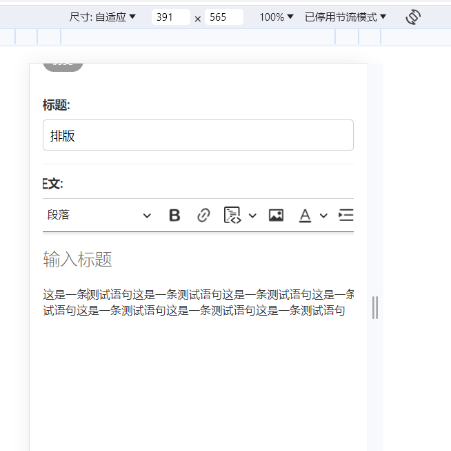
之前那个关于ckeditor5的教程安装完后有个小缺陷,就是移动端使用编辑器时工具栏显示不完全,而且一行内容过长时也看不全。如下图

可以看到工具栏和内容右侧都看不到,应该是我少下载了某个插件或配置有问题。具体安装教程查看这篇文章:Django后台集成CKeditor富文本编辑器
有时候想用手机发个博客非常麻烦,今天实在是受不了了,打算解决一下。对着GPT问了几个小时,也没解决。最后打算用个笨办法,就是按照当前屏幕宽度设置工具栏,把自己常用的工具放到前面就行了,改了下配置文件。
function isSmallScreen() {
    return window.innerWidth < 800;
}

// 初始化 CKEditor
function initEditor() {
    ClassicEditor
        .create(document.querySelector('#id_content'), {
            ckfinder: {
                uploadUrl: '/uploads/'
            },
            licenseKey: '',
            toolbar: isSmallScreen() ? {
                items: [
                    'heading',
                    'bold',
                    'link',
                    'codeBlock',
                    'uploadImage',
                    'fontColor',
                    'indent',
                    'horizontalLine',
                    'bulletedList',
                    'blockQuote',
                    'strikethrough'
                ]
            } : {}
        })
        .then(editor => {
            window.editor = editor;
        })
        .catch(error => {
            console.error('Oops, something went wrong!');
            console.error('Please, report the following error on https://github.com/ckeditor/ckeditor5/issues with the build id and the error stack trace:');
            console.warn('Build id: 1mkmq5sj9fnb-yvaxadk5ookp');
            console.error(error);
        });
}


$(document).ready(function () {
    initEditor();
});
改完之后
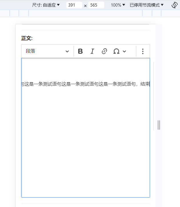
这样自己常用的工具栏就到前面了,勉强能用,但是内容过长时右侧还是看不到的。这时我又想到屏幕宽度低时,就给底部加个滑动条。
.ck-content {
    height: 30em; /* 给编辑器设置高度 */
}


@media (max-width: 800px) {
    .ck-editor {   /* ck-editor 一般都是这个元素 具体可以f12查看一下 */
        overflow-x: auto;
        white-space: nowrap;
    }
}
写完运行一下猛然发现完美适配了移动端,一行内容过长时可以拉动滑动条查看。
显示不全的工具栏也收到右上角三个点里面去了。

哈哈哈,炸胡。写了样式记得把配置文件的toolbar类删除。
如果文章对你有帮助!可点击按钮打赏哦 ~


发表评论
共 0 条评论
暂无评论